Is your roofing website mobile-friendly enough to win you jobs?
- More than half of your customers search for roofing services on their phones.
- If your site looks broken on mobile, they’ll call your competitor instead.
- A mobile-friendly roofing website loads fast and makes it easy to call or message you.
- Google ranks mobile-friendly sites higher, so mobile design brings more traffic.
Most of Your Customers Are Already on Their Phones
You’re under a roof when you get most calls. Your customers are at work, driving, or sitting on their couch. That’s why over 60% of local service searches happen on mobile devices. When someone searches ‘roof repair near me’ and lands on your site, the first thing they notice is how it looks on their screen. If text is tiny, buttons overlap, or they need to zoom in just to read your phone number, you’ve already lost them. A mobile-friendly roofing website respects that busy homeowners don’t have time to mess with clunky design. They want immediate answers and an easy way to reach you. Mobile users spend less time on sites that fight them, and they won’t stick around to become your next customer.
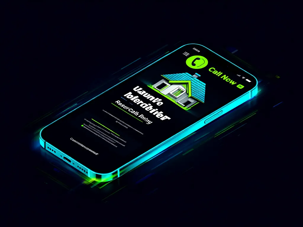
Your Phone Number Should Be Easy to Tap
On a mobile-friendly roofing website, your phone number isn’t just visible—it’s clickable. One tap and they’re calling. You’d be surprised how many roofing sites make people hunt for contact info or type numbers manually. While you’re up on a roof, that missed call could be the difference between a $20,000 job and nothing. Mobile-friendly sites put click-to-call buttons above the fold, along with clear service descriptions and photos that load instantly. No pinching, no squinting, no frustration. Just the information someone needs to choose you over the guy whose site works better on their device.
Google Pushes Mobile-Friendly Sites to the Top
Google’s been prioritizing mobile-friendly sites for years, but the gap keeps widening. When two roofing sites have similar content, Google doesn’t care which one looks better on desktop—only which performs better on mobile. Faster loading times, readable text, and easy navigation all boost rankings. This means a mobile-friendly roofing website doesn’t just convert better visitors into callers—it gets more visitors in the first place. You could write perfect content and still lose to competitors if their site works smoother on phones. Every month you delay means falling further behind in search results where your customers are looking.
What a Mobile-Friendly Site Actually Looks Like
A proper mobile-friendly roofing website has large buttons, readable fonts without zoom, and images that adjust to any screen. Your service areas, pricing pages, and contact forms all stack vertically and load in seconds. Compare that to a desktop site squeezed onto mobile: tiny text, broken layouts, forms you can’t submit. The difference is night and day when someone’s comparing your site to three others while their wife waits in the car. Mobile-friendly design isn’t about bells and whistles—it’s about removing every reason someone might not call you.
If your roofing website frustrates mobile visitors, you’re losing jobs to competitors. See exactly what goes into a mobile-friendly site that wins customers.